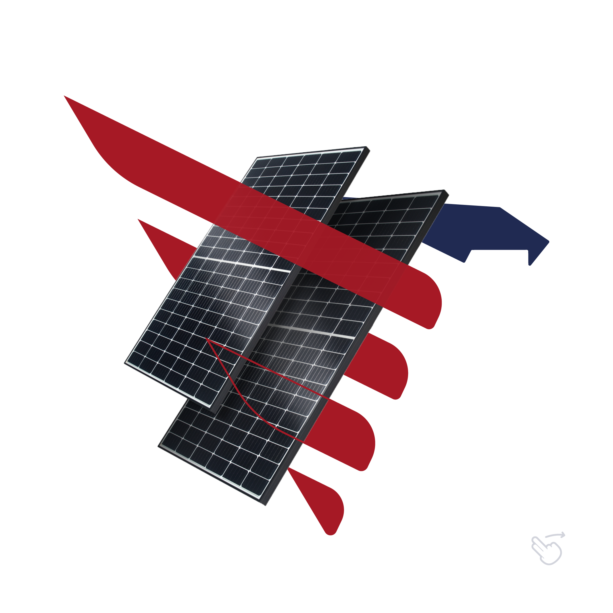
North America Energy – Solar Panel Distribution Branding
North America Energy is a leading distributor of solar panels in the United States, focused on providing innovative solar solutions for the Brazilian market. Our branding for the company is designed to represent power, sovereignty, and efficiency, while maintaining a modern and appealing look suitable for the renewable energy sector.
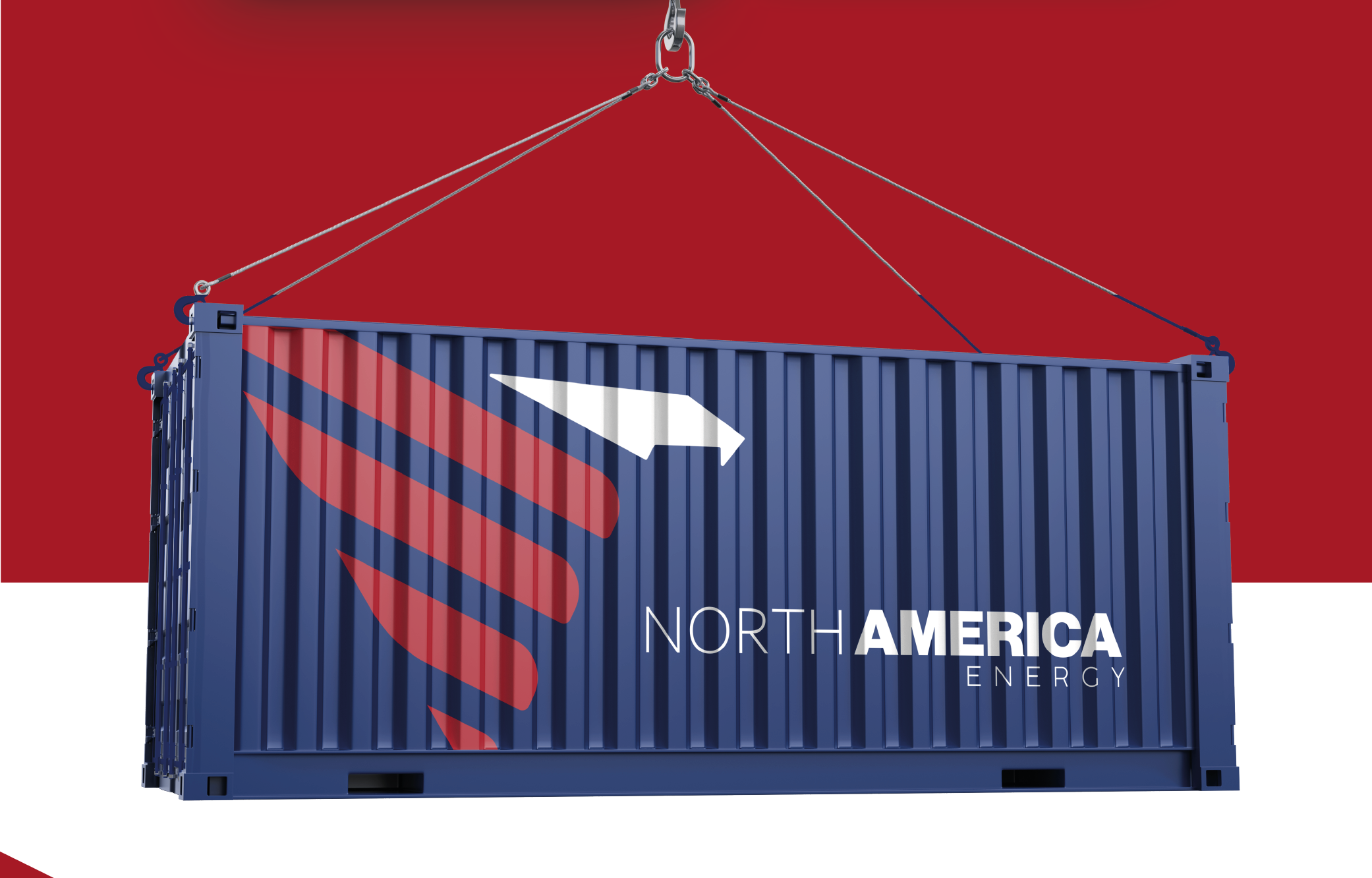
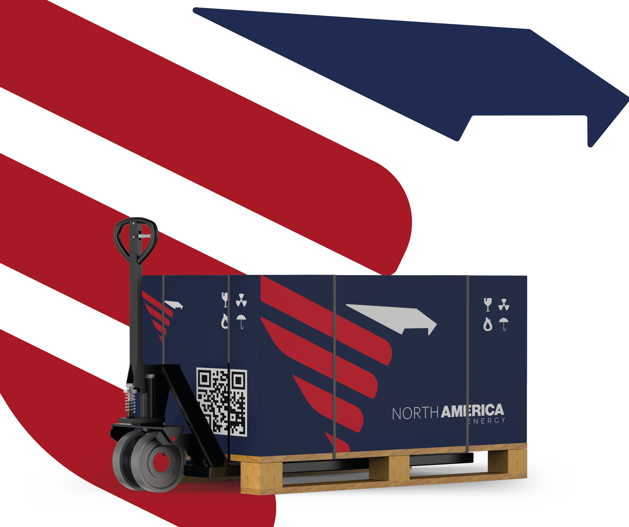
Logo Design: The logo is inspired by the strong and dynamic symbolism of the American eagle, reflecting the company's commitment to innovation and energy leadership. The bold, angular shapes convey power and progress, while the color scheme draws subtle inspiration from the American flag, incorporating red, navy, and white to evoke trust and energy.
Branding Elements:
- Vehicle Wraps: A striking design for transport vehicles, highlighting the brand's energy-focused mission with a bold use of red and navy, accompanied by imagery of solar panels.
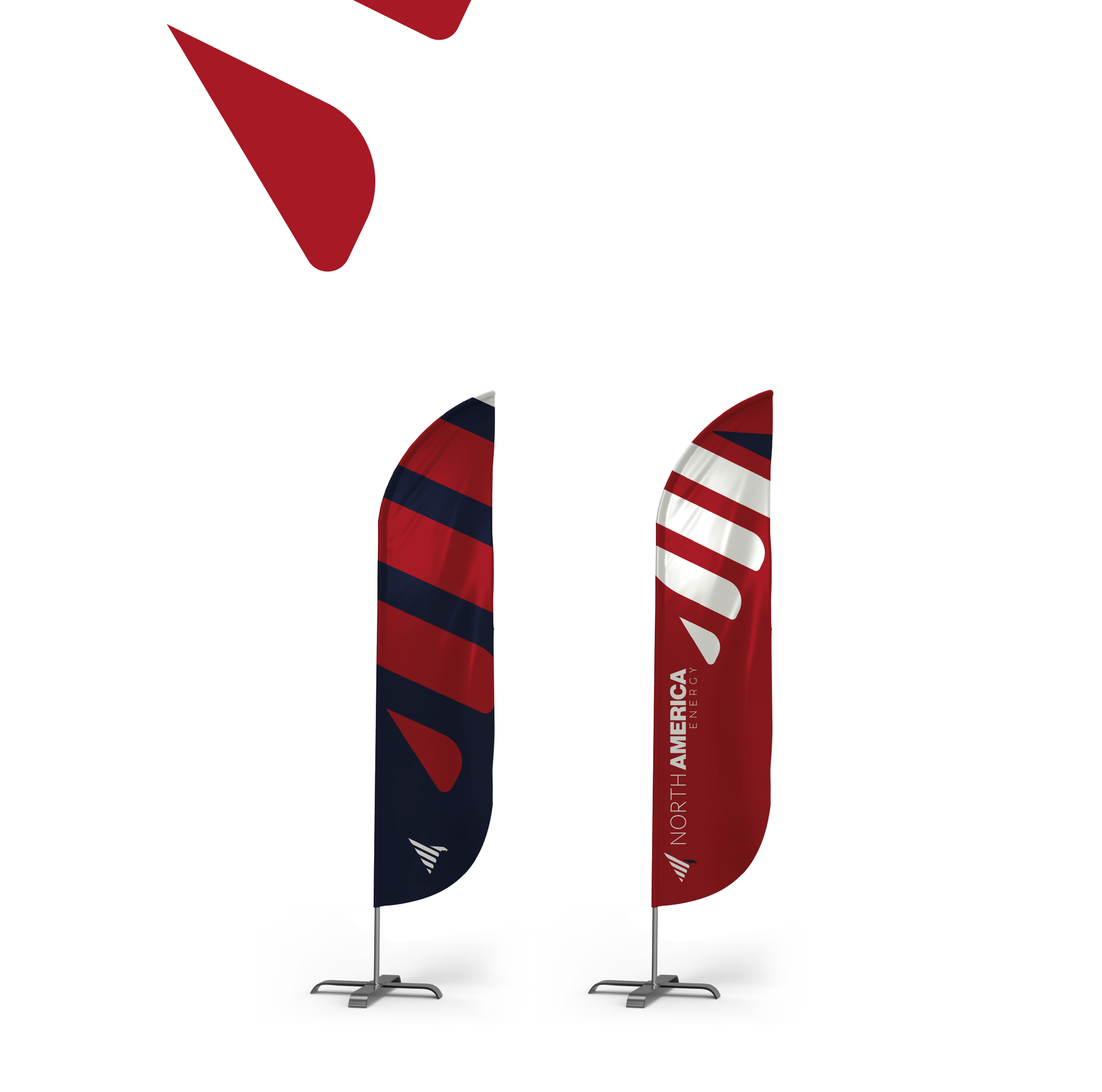
- Outdoor Advertising: Billboards designed to create a strong presence in the market, combining powerful visuals of solar technology and the company's message of premium photovoltaic modules soon to be available in Brazil.
- Uniform Design: Branded uniforms featuring the logo, reinforcing a professional and unified company image across all points of contact.
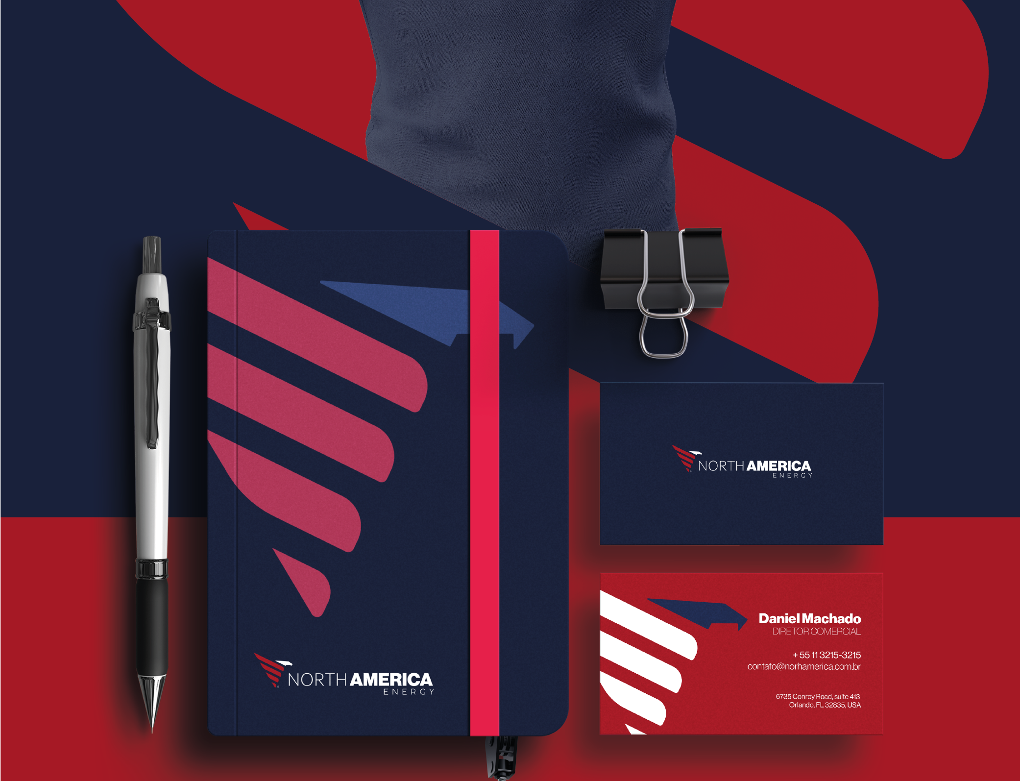
- Corporate Stationery: A suite of stationery items, including business cards, letterheads, and pens, all reflecting the company’s modern identity with striking design elements that reinforce the brand's vision of sustainable energy leadership.
- Website Design: A sleek, modern website showcasing the premium line of photovoltaic modules, with a layout designed to offer easy navigation while emphasizing the brand's core values of sustainability and energy efficiency.
This comprehensive branding strategy positions North America Energy as a forward-thinking leader in the renewable energy sector, combining a modern visual identity with an impactful message of sustainability and progress.


